- Chrome
- Percent-encoding reserved
- HTML5
- lang
- Subresource Integrity
- media type
- icons
- Events
- CSS box model
- box-sizing
- content
- padding
- border
- margin
- Spacing
- Mobile
- Flexbox
- UI Frameworks
- Bootstrap
- Version 3
- Version 4
- Version 5
- Grid system
- forms
- whitespace and wrap
- robots
- Frameworks
Chrome
hard reload: Ctrl + F5
F12 -> Ctrl+Shift+P -> "screenshot"
delete address history: Shift + Del
remove domain name: F12 -> console
    document.body.innerHTML = document.body.innerHTML.replace(/\.\w+\.\w+(?=:)/g, "")
Percent-encoding reserved
https://en.wikipedia.org/wiki/Percent-encoding |!|#|$|%|&|’|(|)|*|+|,|/|:|;|=|?|@|[|]| |—|—|—|—|—|—|—|—|—|—|—|—|—|—|—|—|—|—|—| |%21|%23|%24|%25|%26|%27|%28|%29|%2A|%2B|%2C|%2F|%3A|%3B|%3D|%3F|%40|%5B|%5D|
HTML5
https://www.w3.org/TR/html5
https://developer.mozilla.org/en-US/docs/Web/HTML/Element
lang
empty string indicates that the primary language is unknown
https://www.w3.org/TR/html5/dom.html#the-lang-and-xml:lang-attributes
http://www.ietf.org/rfc/bcp/bcp47.txt
Subresource Integrity
https://www.w3.org/TR/SRI/#resource-integrity
media type
MIME type or content type: http://www.iana.org/assignments/media-types/media-types.xhtml#application
application/pdf
audio
font
example
image
message
model
multipart
text
video
icons
https://github.com/encharm/Font-Awesome-SVG-PNG/tree/master/white/svg
Events
https://developer.mozilla.org/en-US/docs/Web/Events
cut/copy/paste
input: the value of an <input>, <select>, or <textarea> element is changed
ValueChange: mainly for an accessibility purpose, e.g.: <progress>
change(Firefox OS specific, any change made to a file inside a given storage area)
CSS box model
https://developer.mozilla.org/en-US/docs/Web/CSS/CSS_Box_Model/Introduction_to_the_CSS_box_model
Every box is composed of four parts (or areas), defined by their respective edges.
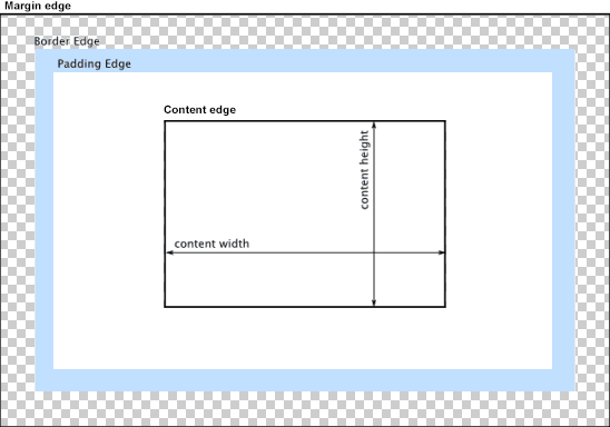
box-sizing
https://developer.mozilla.org/en-US/docs/Web/CSS/box-sizing
content-box is the default.
border-box tells the browser to account for any border and padding in the value you specify for width and height.
content
“real” content of the element
size can be explicitly defined with the width, min-width, max-width, height, min-height, and max-height properties.
When the content area has a background, it extends into the padding.
padding
extends the content area to include the element’s padding.
dimensions: padding-box width/height
thickness: padding[-top/right/bottomleft]
border
extends the padding area to include the element’s borders.
dimensions: border-box width/height
thickness: border[-width]
If the box-sizing property is set to border-box, the border area’s size can be explicitly defined with the width, min-width, max-width, height, min-height, and max-height properties.
margin
extends the border area to include an empty area used to separate the element from its neighbors.
dimensions: margin-box width/height
size: margin[-top/right/bottomleft]
When margin collapsing occurs, the margin area is not clearly defined since margins are shared between boxes.
https://developer.mozilla.org/en/CSS/margin_collapsing
Spacing
https://getbootstrap.com/docs/4.0/utilities/spacing/
Examples: class="mx-auto / pt-3"

{property}{sides}-{size} for xs
{property}{sides}-{sm, md, lg, xl}-{size}

m - margin
p - padding

t - top
b - bottom
l - left
r - right
x - *-left and *-right
y - *-top and *-bottom
blank - all 4 sides

0 - 0
1 -$spacer * .25
2 -$spacer * .5
3 -$spacer
4 -$spacer * 1.5
5 -$spacer * 3
auto - margin auto
Mobile
https://developer.mozilla.org/en-US/docs/Mozilla/Mobile/Viewport_meta_tag
viewport: a virtual "window"
viewport meta tag: let web developers control the viewport's size and scale.
initial-scale: The default is calculated to fit the webpage in the visible area.
maximum-scale:  The default is 5.0. The range is from >0 to 10.0.
user-scalable: whether or not the user can zoom in and out. yes
shrink-to-fit=no: override  "width=device-width" to prevent the page from scaling
    <meta name="viewport" content="width=device-width, initial-scale=1.0, shrink-to-fit=no">
Flexbox
- Game: https://flexboxfroggy.com/
- Doc: https://developer.mozilla.org/en-US/docs/Learn/CSS/CSS_layout/Flexbox
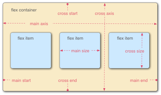
Click links to live try: - flex-direction: specifies which direction the main axis runs; column -> vertically - flex-wrap: default nowrap - flex-flow = flex-direction + flex-wrap - justify-content: default flex-start, items sit at the start of the main axis - align-items:default stretch,fill the parent in the direction of the cross axis - align-content:around content items along a flexbox’s cross-axis - flex: grow or shrink to fit the space | flex-grow + flex-shrink + flex-basis
UI Frameworks
https://github.com/stars/fzinfz/lists/frontend
Bootstrap
Version 3
https://getbootstrap.com/docs/3.3/getting-started/#download-cdn
Version 4
https://v4-alpha.getbootstrap.com/getting-started/introduction/#starter-template
http://blog.getbootstrap.com/2017/08/10/bootstrap-4-beta/
- compiles faster than ever thanks to Libsass
- moved nearly everything to flexbox, added a new grid tier to better target mobile devices, and completely overhauled our source Sass with better variables, mixins, and now maps, too.
- https://getbootstrap.com/docs/4.0/components/card/
- move gradients, transitions, shadows, grid classes, and more into Sass variables.
- drop support for IE8/IE9, Safari 8-, iOS 8-, etc
- JS plugins in ES6. new teardown methods, option type checking, new methods, and more.
- auto-placement of tooltips, popovers, and dropdowns from https://popper.js.org
- npm scripts instead of Grunt
Version 5
https://blog.getbootstrap.com/2021/05/05/bootstrap-5/
No more jQuery!
Dropped Internet Explorer 10 and 11
Dropped Microsoft Edge < 16 (Legacy Edge)
Dropped Firefox < 60
Dropped Safari < 12
Dropped iOS Safari < 12
Dropped Chrome < 60
Grid system
https://getbootstrap.com/docs/3.3/css/#grid
Rows must be placed within a .container[-fluid] for proper alignment and padding. Columns create gutters (gaps between column content) via padding. That padding is offset in rows for the first and last column via negative margin on .rows.
forms
https://getbootstrap.com/docs/4.0/components/forms/#form-groups
.form-group provides a flexible class that encourages proper grouping of labels, controls, optional help text, and form validation messaging.
.row for .form-row, a variation of our standard grid row that overrides the default column gutters for tighter and more compact layouts.
https://getbootstrap.com/docs/4.3/components/forms/#inline-forms
.form-inline class to display a series of labels, form controls, and buttons on a single horizontal row.
whitespace and wrap
https://css-tricks.com/almanac/properties/w/whitespace/
| New lines | Spaces and tabs | Text wrapping | |
|---|---|---|---|
| normal | Collapse | Collapse | Wrap |
| pre | Preserve | Preserve | No wrap |
| nowrap | Collapse | Collapse | No wrap |
| pre-wrap | Preserve | Preserve | Wrap |
| pre-line | Preserve | Collapse | Wrap |
robots
<META NAME="ROBOTS" CONTENT="INDEX, FOLLOW">

robots.txt
    User-agent: Google
    Disallow:

    User-agent: *
    Disallow: /tmp/
Frameworks
htmx | AJAX, CSS Transitions, WebSockets and Server Sent Events: https://htmx.org/